
Color is a powerful tool in interior design that goes beyond aesthetics. The psychology of color explores how different hues can influence emotions, behaviors, and overall mood within a space. This is a vital element in interior design, because the right color choices can create a desired atmosphere, evoke specific feelings, and even impact how people interact with a specific room.
Importance of the Psychology of Color (ทดสอบ)
Color in interior design is more than just a visual element. Color plays a crucial role in shaping the atmosphere and the whole experience of a space. Understanding the psychology of color can help you see how different colors can evoke emotions, influence behavior, and set the tone for a space.
Colors communicate messages without words. The psychology of color is crucial in creating balanced and harmonious environments. Understanding the psychology of color is essential while you create the space you truly feel at home in.
How Different Interior Design Color Choices Affect Mood & Behavior
Color in interior design is more than just a visual element. Color plays a crucial role in shaping the atmosphere and the whole experience of a space. Understanding the psychology of color can help you see how different colors can evoke emotions, influence behaviour, and set the tone for a space.
Colors communicate messages without words. The psychology of color is crucial in creating balanced and harmonious environments. Understanding the psychology of color is essential while you create the space you truly feel at home in.
Warm Colors (Red, Orange, Yellow)
These colors are known to energise and stimulate. Red can evoke passion and excitement, making it a popular choice for dining rooms and social spaces. Orange promotes enthusiasm and creativity, while yellow is associated with happiness and warmth, perfect for kitchens and play areas.
Cool Colors (Blue, Green, Purple)
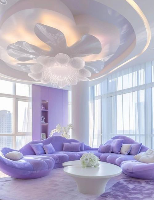
Cool colors have a calming and relaxing effect. Blue is often used in bedrooms and bathrooms to create a tranquil environment. Green represents balance and renewal, ideal for living rooms and spaces where relaxation is key. Purple, often linked with luxury and creativity, can add a touch of elegance to any room.
Neutral Colors (White, Gray, Beige)
Neutral colors provide a versatile backdrop that can balance out bolder colors or stand alone for a minimalist look. White conveys purity and spaciousness, gray adds sophistication, and beige offers warmth without overwhelming the senses.
Cultural Differences in Color Perception & Interpretation
Color meanings can vary significantly across different cultures. For example, while white is often associated with purity and peace in Western cultures , it is linked to mourning in some Eastern cultures . Red, symbolizing good luck and prosperity in China, can be associated with danger or warning in other contexts. Understanding these cultural differences is crucial when designing spaces for diverse audiences.
Choosing The Right Color Palette for Each Room
Color meanings can vary significantly across different cultures. For example, while white is often associated with purity and peace in Western cultures , it is linked to mourning in some Eastern cultures . Red, symbolizing good luck and prosperity in China, can be associated with danger or warning in other contexts. Understanding these cultural differences is crucial when designing spaces for diverse audiences.
Living Room
The heart of the home deserves to be inviting and comforting. Palette that utilizes both warm & neutral tones can help create a space full of comfort & connection. Imagine the subtle glow of creamy beiges paired with the rich depth of a warm terracotta or the understated elegance of a soft taupe.
Bedroom
A private retreat from life outside. To inspire a sense of calm, consider palettes with soft blues, gentle greens, or lavenders. These hues are synonymous with peace and relaxation, each offering a different facet of tranquility.
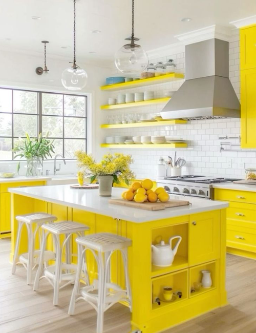
Kitchen
The kitchen is a vibrant hub of energy and creativity, a place where the alchemy of cooking and the art of dining come together. To reflect this dynamic, opt for a palette of bright, energizing colors like sunny yellows or zesty oranges.
Home Office
Cool, calming colors like sophisticated blues or refreshing greens are ideal for creating an environment that fosters concentration and clarity. Complement these with neutral tones like crisp whites or elegant grays to maintain a professional ambiance that is both stylish and functional.
Why Choose a Professional Interior Design Company?
Selecting the perfect color palette for each room involves more than just personal preference; it requires an understanding of color psychology, cultural nuances, and the specific needs of the space. This is where a professional interior design company in Bangkok like PAD comes in. With expertise in color theory and design principles, PAD can effortlessly guide you through the process, ensuring that every room in your home not only looks stunning but also functions optimally, enhancing your overall quality of life.